Management Dashboard
Management > Management Dashboard puts the figures of a period side by side with the period of the same length just before it. It opens on the current month to date, against the same number of days before.
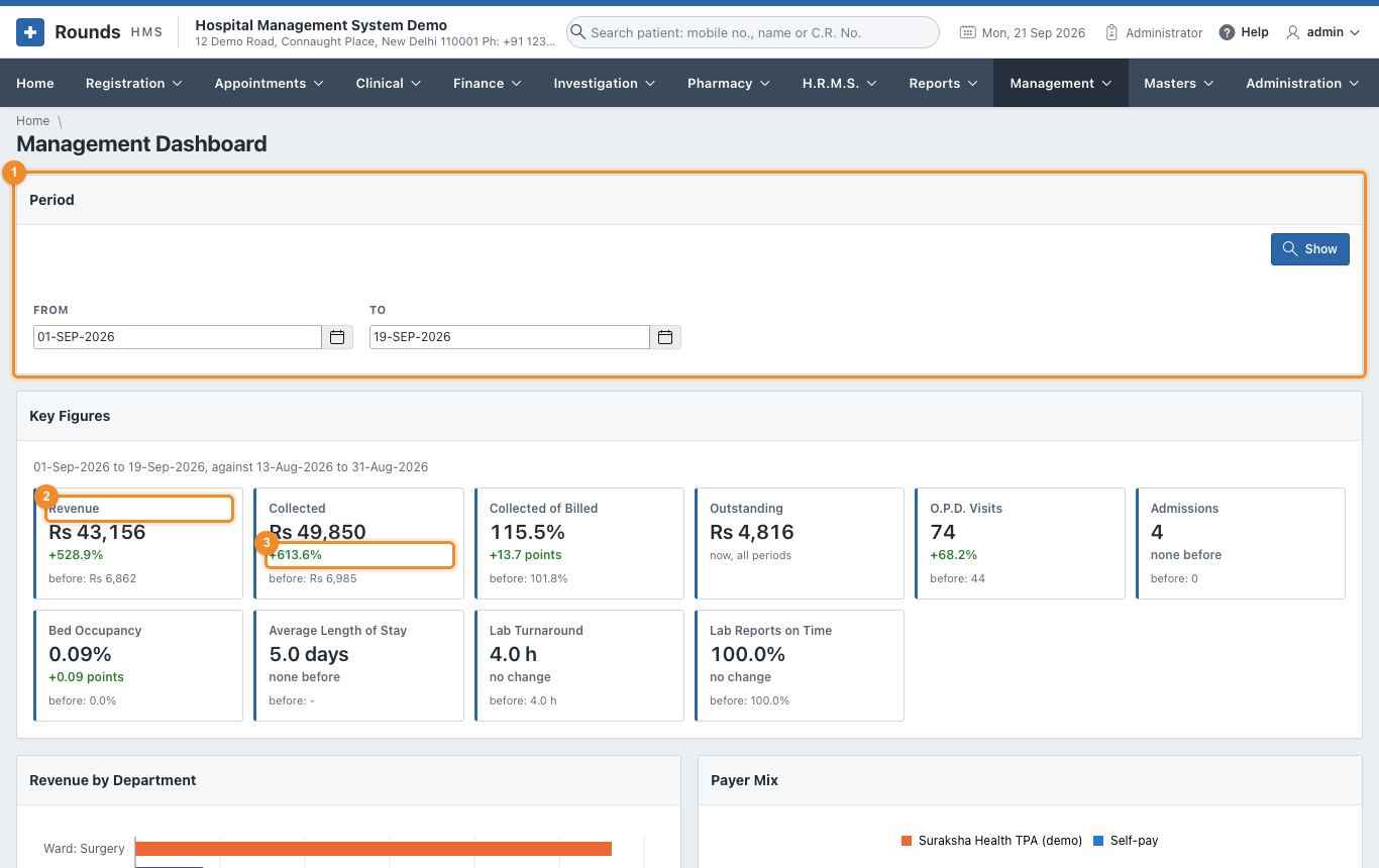
- Period: choose From and To and click Show. The line under Key Figures says which period the figures are compared with.
- A figure: its value for the period. Click the box to open the page behind it, for the same period (Revenue opens Revenue by Department and Doctor, Bed Occupancy opens Occupancy and Length of Stay ...).
- The change against the period before: green when it is better, red when it is worse. For revenue more is better, for the average length of stay and the lab turnaround less is better. A percentage (occupancy, collected of billed) changes by points. none before means the earlier period had nothing to compare with. Outstanding is what is owed today, so it has no comparison.
| Figure | Meaning |
|---|---|
| Revenue | everything billed in the period |
| Collected | everything received in the period, less refunds |
| Collected of Billed | Collected as a percentage of Revenue; over 100% when old dues or advances came in |
| Outstanding | what patients and insurers owe today |
| O.P.D. Visits | new registrations and renewals |
| Admissions | patients admitted |
| Bed Occupancy | how full the wards were |
| Average Length of Stay | days in hospital of the patients discharged |
| Lab Turnaround | average hours from the order to the verified report |
| Lab Reports on Time | the share of reports verified within their target |
The charts
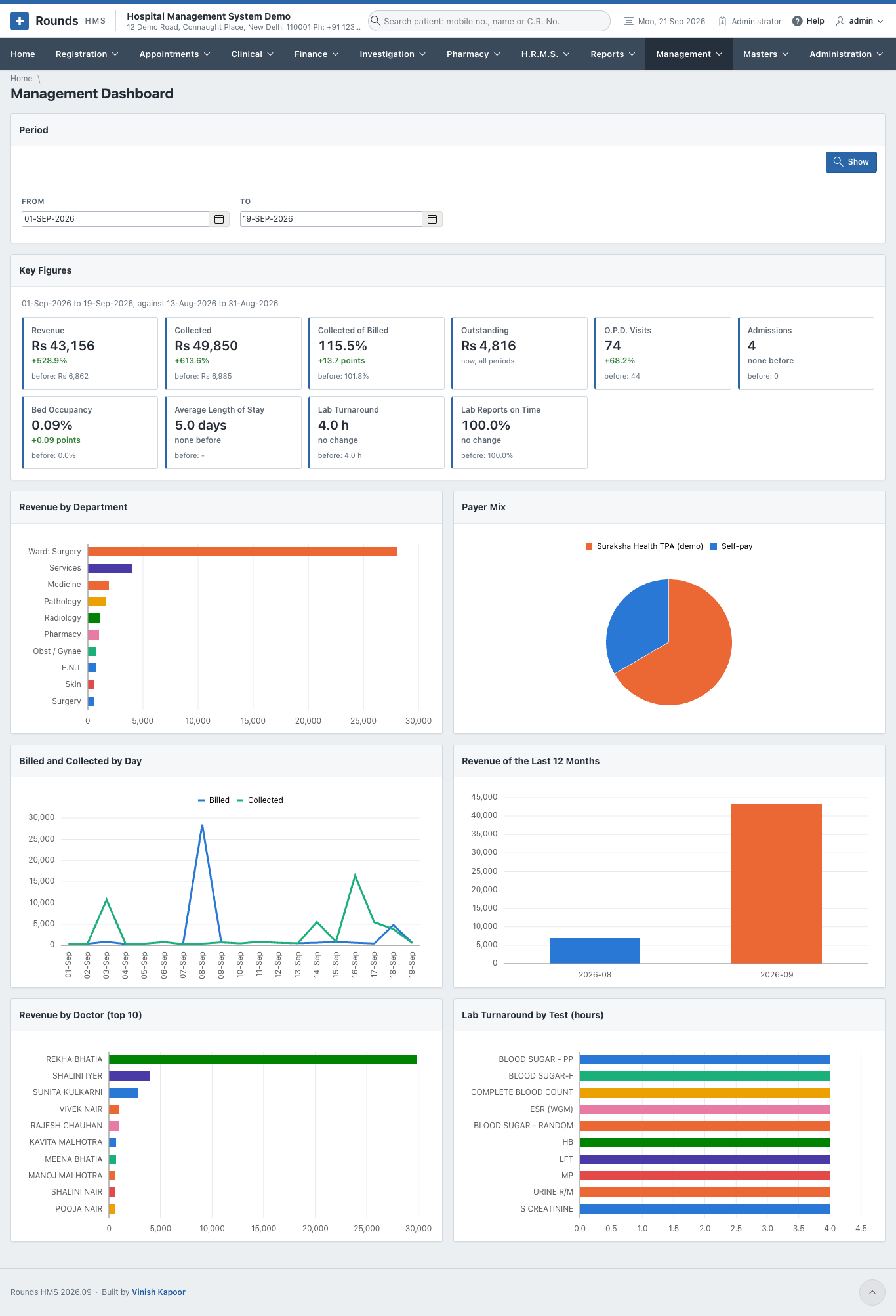
Under the figures six charts show the same period: revenue by department, the payer mix, billed and collected day by day, the revenue of the last twelve months, the ten doctors with the most revenue, and the lab turnaround by test. Point at a bar or a slice to see its value.
Tip
The figures are worked out when the page opens, from the bills and registers themselves. A bill saved a minute ago is already counted.